BTS: Template To Life
this blog post contains affiliate links, all opinions are our own.I love behind-the-scenes and if you do too, you’ll love this post as well. Let me share with you this short and sweet shoot that we wrapped 2024 with. Our client, Summer Wheaton, reached out to us to create imagery for the launch of her product, Template To Life, a faith-based planner aimed at those wanting to live intentionally and grow spiritually. The planner itself is a stunning dark woodsy green color with a tree design in the front of it and gold foil text. Even though the number of deliverables was small for this particular shoot, we really wanted to capture the elegance of the planner while also thinking about our client’s audience and how we would want them to feel about using this planner. Soooo… we got straight to work!
Elle killed it with the shoot plan as per usual. In order to evoke the feeling of being grounded, a lot of the textures and colors chosen for this shoot was pretty simple. Go natural but elegant. By keeping things monochromatic and choosing similar dark green tones, we were able to bring in that “luxurious” feel to the images. However, the sandstone textured background also contributed to the overall vibe by allowing the images to feel natural at the same time. After all, growing is a “natural” process of life, isn’t it? See what I did there… Ok, ok! But you know what I mean. Keeping with the theme of “growth,” we needed to include some real natural elements to our images. We’re always thankful for Trader Joe’s for keeping such lovely greenery and florals in stock for us to play with on set. Check out some of the mockups Elle created below for our shoot plan. Oh, and if you are a fan of some of the backgrounds in this shoot, we purchased some from Club Backdrops as well as Cosita Backdrops (our favessss and if you click here you can get 15% off!)
Hot Tip: For launches or product campaigns, use the same backgrounds and certain props in multiple ways in order to create cohesion throughout the shoot. You can see below how we used the green tile and sandstone background multiple times as well as the white florals.
Some of the still life ideas were straightforward on the day of our shoot like the “potted” planner with florals or the lifestyle scene of a quaint journaling moment complete with a lit candle, matches, green nail polish, coffee, and some flowers in a vase. For one of the GIFs, the idea was a simple: an open and close motion of the planner so we could see the inside of it. However, the second GIF was much more complex as it involved making it look like flowers were blooming out of the planner. We accomplished this by shooting the whole animation backwards meaning we styled the “last frame” first. This allowed Elle to be able to cut down the florals bit by bit for each frame to give the illusion of the flowers “growing” once the frames were arranged in reverse.
And of course, our client was on set virtually via a Google Meet which made things go extra smoothly. It also allowed us to explain any retouching that we planned to take care of in post. This was definitely one of those shoots where the retouching was really going to make the biggest difference. Speaking of post-production, the monochromatic scenes made it so fun to edit. I managed to finish up the entire shoot with time to spare. Unheard of honestly, haha. Of course, we also used our incredible HRD toning presets to give those photos the punchy and vibrancy they deserved. Sign up for our newsletter here and you’ll get both “The Oomph” and “The Grit” to use including a PDF showing you how to apply them.
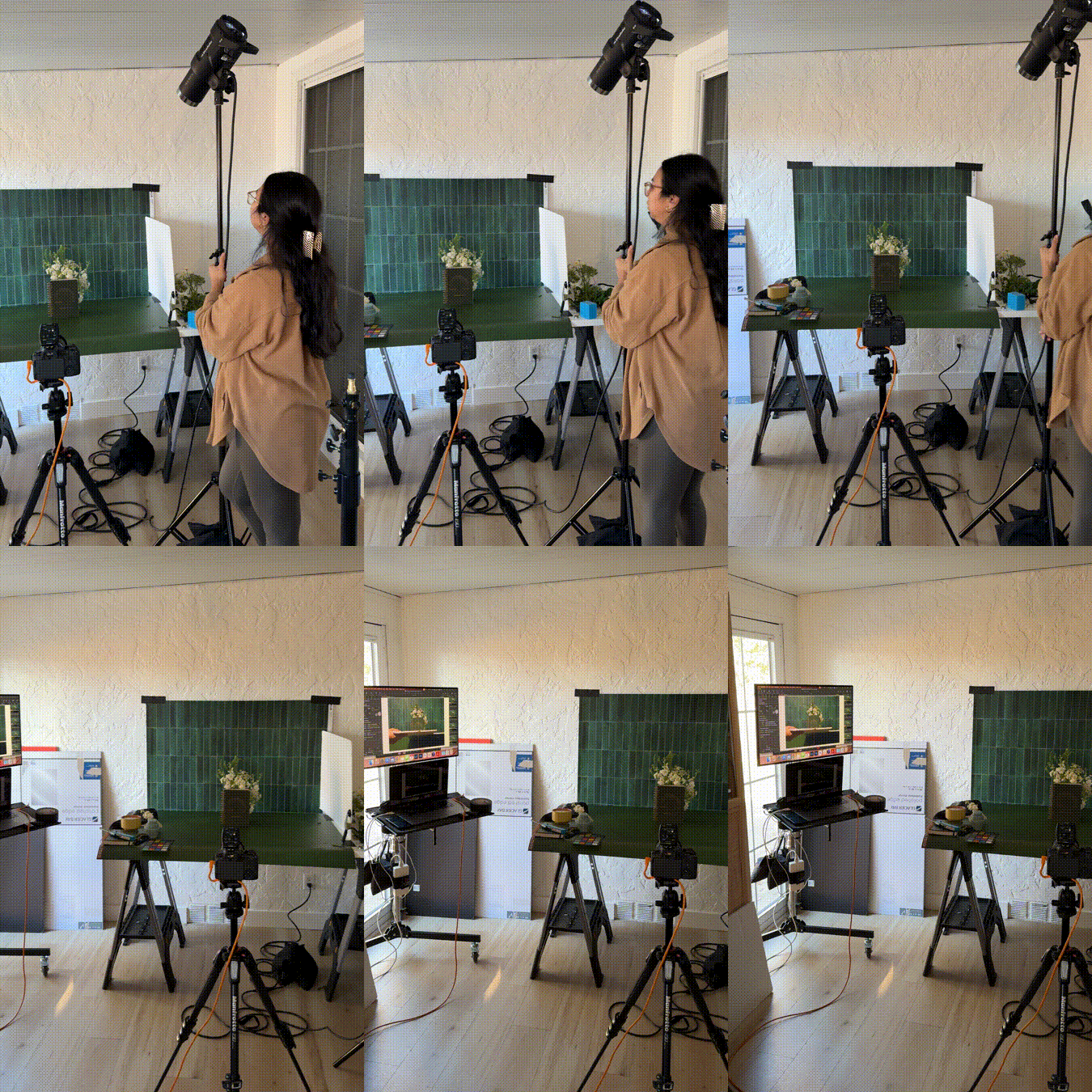
View some of the BTS below and click the link at the bottom to view the final photos.
Is it the weekend yet?
Arabela


